Design Philosophy Series: Building a mid-century modern Atomic Ranch – turning feelings and thoughts into ideas on paper
Please see the prior post here for the answer to the question – Why build a mid century modern house in the early 21st century
At this point in my process, I had the land, the permits (thanks to the Fields hard work prior to selling the land to me!), and a builder picked out. I also had a lot of years of thinking about the feelings and features I wanted out of a house and some interesting photos of other projects (see my Idea Book on Houzz.com for Kitchen, Bath, Bath and Bath ideas )
- Fohl alternate concept site location and plan layouts This was the initial Deck idea overlaid on the original plot plan and 5 bedroom house building permit that came with the land
- 458A SDSB_FF this is the final stamped and approved plot plan
I purchased a copy of Google sketchup – because that is what Deck was using for pre-visualization and that turned out to be unnecessary as I gave them PDFs only – lol. I started planning layout ideas for them to work from.
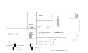
I had the general idea of layout for passive solar gain – orienting the house for the sun and correct calculation of the eaves for sun in the winter and shade in the summer – but what next? For simplicity, I wanted the utilities to be compact and central within the house, and the amount of wasted space with hallways to be minimized. We put the mechanical room, the wash room, kitchen and bathrooms all back to back in the central core of the house – and with easy access to the outside via a carport. The original thought of a 3 bay garage (two for the wood/metal shop) had gone out the window due to cost.
Centrally locating all the utilities does a couple of things – one, it reduces the run of water (less leak opportunities and cost) and it puts these spaces in well insulated interior areas while leaving views from all the more public areas.
This photo on Houzz really made me sit up and take notice and has been a central reference point throughout the project – we are copying a lot of the ideas here. Specifically note:
- The layout of the house overall – the entryway /main door is to the left. We used this idea as well
- The right hand side of the kitchen leads off to a more private area – with a blocking wall. I incorporated this flow by having the bedrooms and bathrooms in that direction – separating the public space from the private
- The sink and main appliances are along the back wall with cabinetry flanking the sink. This fit well with my idea of placing all the water flow back to back in the core of the house
- The island is a both a cooktop and a table – and is at table height instead of counter or bar height. I experimented and decided that the cook top at the 29″ of a standard table would work for me
- There is an overhead, custom lighting drop panel. One thing I realized is that the island would not naturally have overhead lighting since the roof could be quite a bit above you at this point. This is a key design feature
We decided not to follow the design here with a few items
- We are not going with the color scheme of the tile! Instead I am planning on white subway tile with an accent color tile stripe
- The stainless steel ventilation hood has been removed in favor of a down draft vent through the floor and out under the building
In terms of bathroom design, I never, ever take a sit down bath so my initial thought was to have open air walk in showers (aka – Wetroom) for both baths. Ultimately, I decided that both for flexibility and cost, to put a shower/tub one piece in the guest bath. However for the master bath, I went for the wetroom feel. This ideabook on Houzz.com (I mashed Kitchen and bath together for no particular reason) had several ideas on how to design a walk in, curbless, shower.
Due to self imposed space constraints, I made the bathrooms big enough for use, but not palaces – under the idea that you used them and then left – the limited square footage was better used elsewhere. This I think is going to lead to the wetroom needing a glass partition that will keep the spray organized – just because there is not going to be enough square footage to have a ‘section’ for the rain fall shower that is isolated. That is ok I think.
The vanities in both baths will be floating for easier cleaning.
In terms of bedrooms, again, I kept them purposely small since my habit is not to hang out in the bedroom. My thought is that you sleep there, store your clothes there and change. Otherwise, they are not used. A smaller room is easier to keep warm and doesn’t waste as much space. The layout we came up with managed to keep the hallway run to an absolute minimum
In the next Atomic Ranch post, I will tackle the great room
